App revamp
Revamping the shopping app with a scalable design system.

Design Systems
Craft Leadership
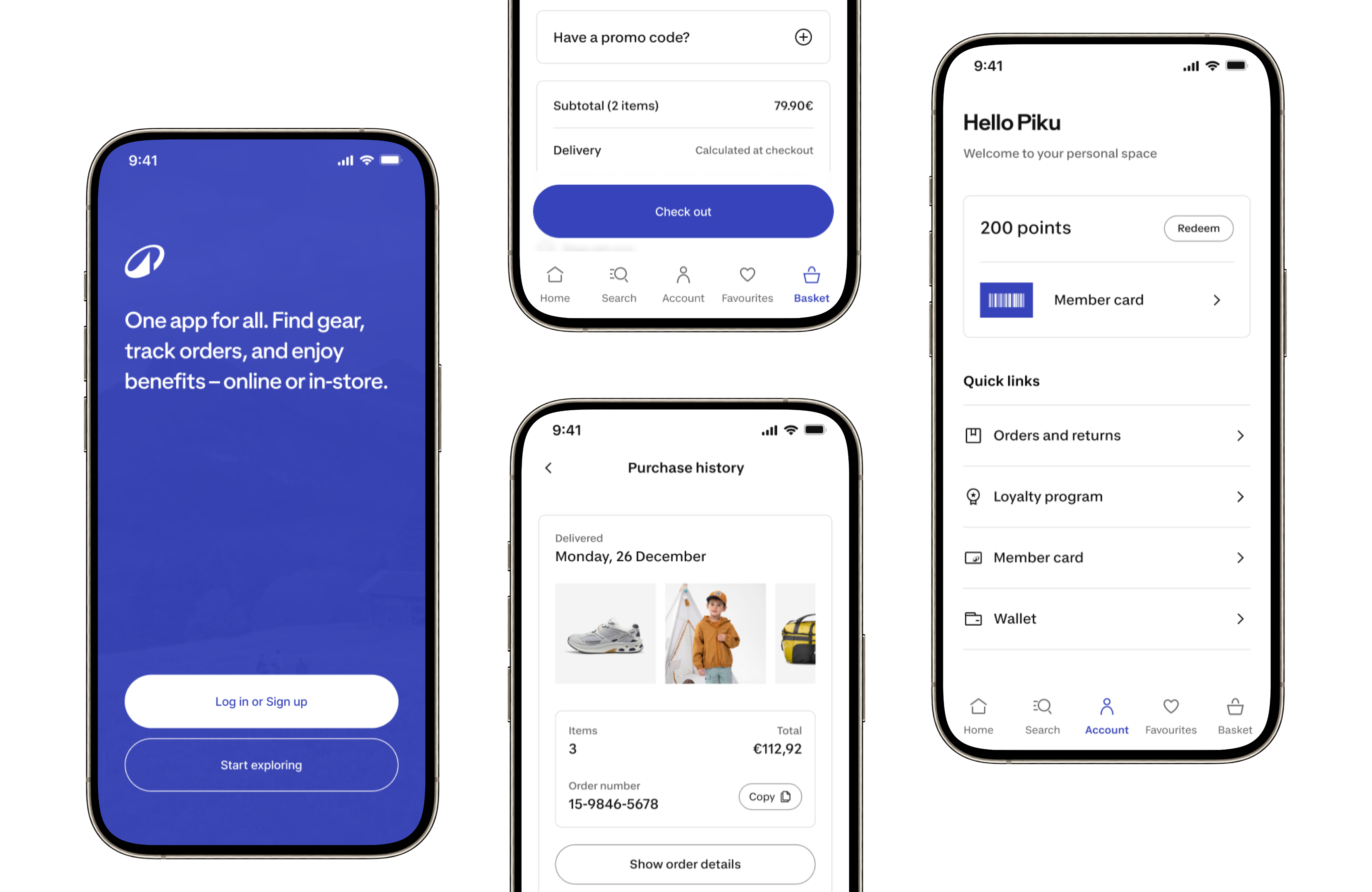
At a glance
Scope
Brand ID strategy, foundation updates, app-specific component system, core screen revamp, design guidelines, and experience principles translation.

Impact & contribution
Implemented the new Brand ID across core app foundations without dedicated redesign sprints, created List Flex, a scalable component now used across around 80% of app screens, and reduced duplicated design/development patterns.
And I turned a brand refresh into a scalable app experience system, balancing brand expression, product roadmap delivery, native platform quality, accessibility, and long-term maintainability.
Decathlon introduced a new Brand ID connected to its broader North Star: moving people through the wonders of sport. The Shopping App needed to adopt this new identity, but the challenge was not simply applying new colors, typography, icons, and components.
The real challenge was strategic. How could we implement the new Brand ID progressively, without dedicated redesign sprints, while minimizing impact on the product roadmap and using the opportunity to improve product craft, consistency, and design system scalability?
I led the Brand ID implementation strategy for the Shopping App, presented it to Product, Design, and App leadership, and secured approval. I then worked with platform, engineering, design system, and product partners to update app foundations, adopt available design system components, and create app-specific scalable components.
The app needed to evolve without stopping roadmap delivery
There were no dedicated sprints for a full revamp. Product teams still needed to deliver business and user opportunities, so the rollout had to work within existing roadmap priorities.
The new design system did not cover all app needs
The central native design system covered only part of the Shopping App’s needs. Many app-specific patterns were still owned and maintained internally by the Shopping App team.
App-specific components were fragmented
During my audit, I found that similar display patterns were being solved with different components across different screens. For example, the app had multiple components serving similar list or content-display purposes.
This created three risks
- Inconsistent experience for users
- More maintenance effort for designers
- More duplicated implementation effort for engineers
The biggest risk was treating Brand ID as decoration: new colors, new typography, new icons, same experience problems.
I wanted to use the revamp as an opportunity to improve the product system behind the interface: foundations, components, screen quality, accessibility, and experience principles.
This connects strongly to the App Design & Experience Direction, which defines the purpose as creating a customer/member-first experience that gets people quickly to the right next step while communicating Decathlon’s value around convenience, trust, guidance, value, personalization, and omnichannel.
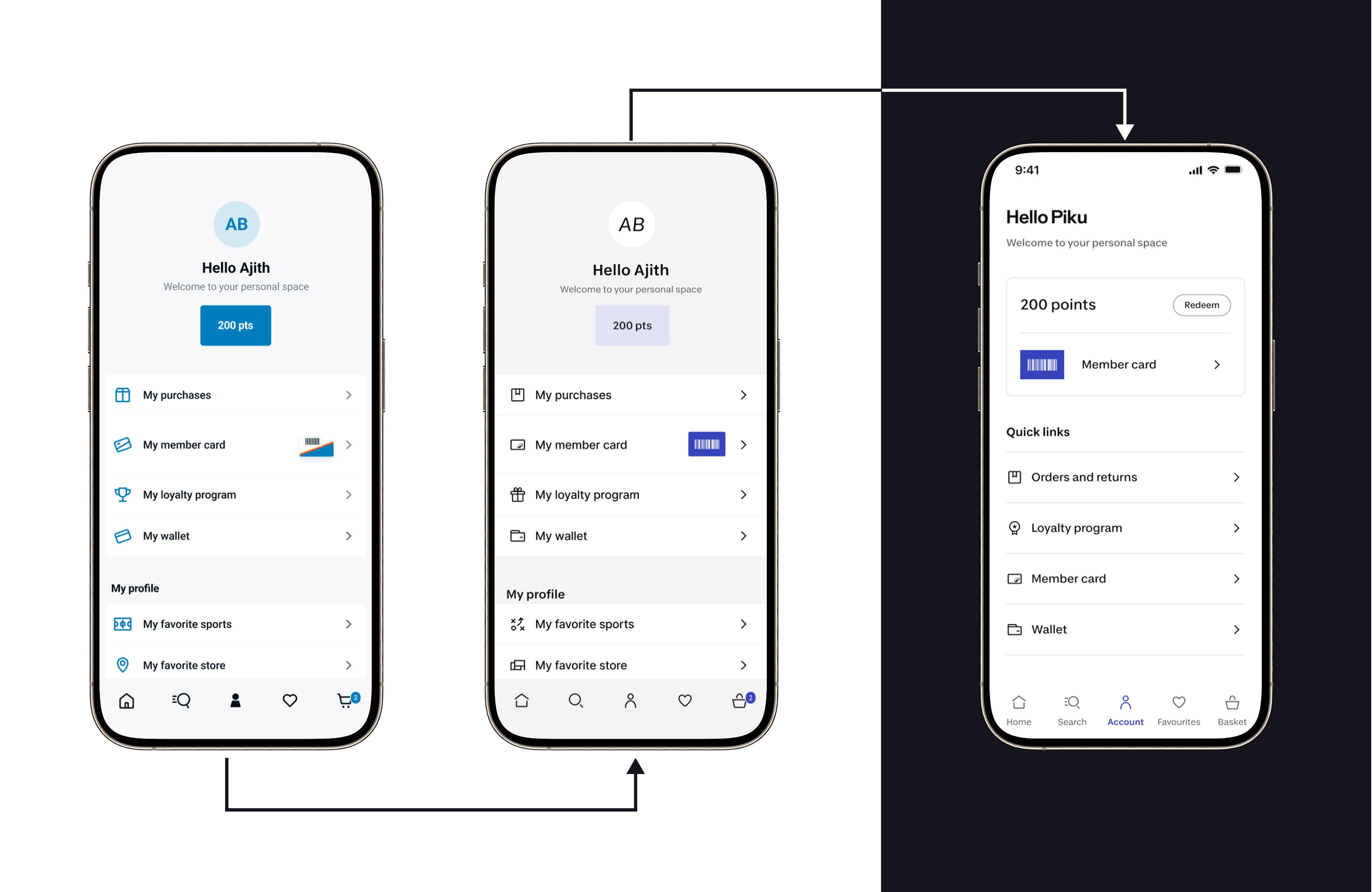
A progressive Brand ID update that improved the Account screen’s hierarchy, clarity, and sense of personal ownership.
Create a progressive rollout strategy and secure leadership approval
My first contribution was making the Brand ID rollout feel achievable and valuable for leadership.
I presented a strategy to Product, Design, and App leadership that avoided a risky “big bang” redesign. Instead, I proposed a progressive model.
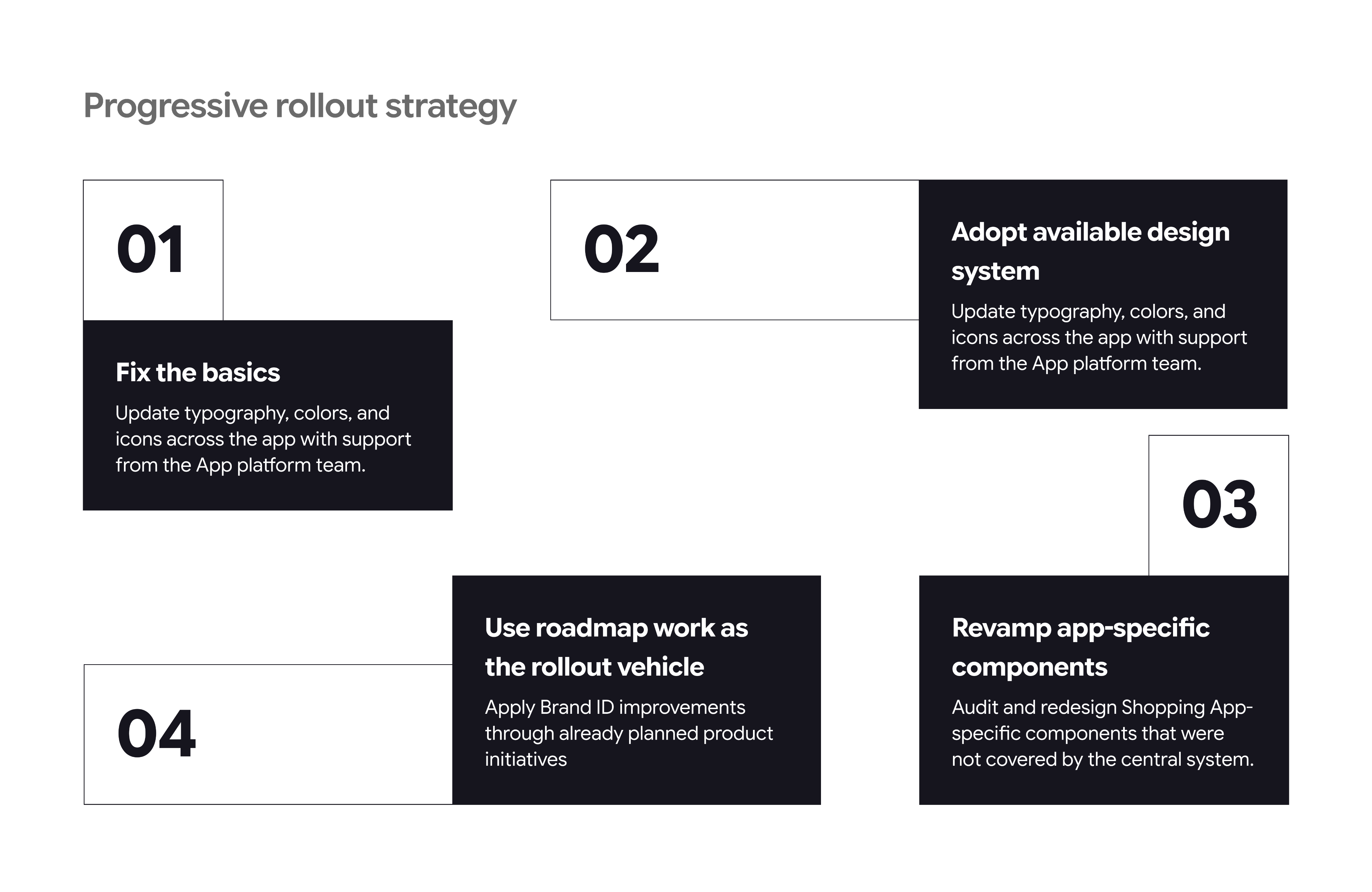
Fix the basics firstUpdate typography, colors, and icons across the app with support from the App platform team.
Adopt available design system componentsImplement central design system components where they already existed, such as CTAs and form inputs.
Revamp app-specific componentsAudit and redesign Shopping App-specific components that were not covered by the central system.
Use roadmap work as the rollout vehicleApply Brand ID improvements through already planned product initiatives, so the revamp would not require dedicated redesign sprints.
This helped get approval because the strategy balanced brand ambition with roadmap reality.
Use roadmap priorities to drive implementation
Instead of creating a separate Brand ID backlog, I mapped the app screens involved in already planned roadmap work.
For example, when roadmap initiatives touched areas like Purchase History, Cart, Checkout, Account, or PDP, we used those moments to apply the new Brand ID and improve screen quality.
This allowed the team to modernize the app without slowing down user and business priorities.
The trade-off was that the app could temporarily feel visually inconsistent while only some screens were revamped. To manage that, I later helped prioritize critical journey screens so the experience would feel more coherent across the core shopping flow.
Turned component fragmentation into a design system opportunity
The central design system covered only part of the app, so I led an audit of app-specific components.
I mapped
- Which components appeared across screens
- Where similar use cases were being solved differently
- Which patterns could be consolidated
- Which components needed to respect native iOS and Android expectations
- Which elements needed to be flexible enough for multiple app contexts
This led to the creation of List Flex, a scalable app-specific component that now acts as a base component for around 80% of app screens.
Translated experience principles into practical app guidance
Together with the Design Director, the team defined 10 experience design principles for the app. The direction frames these principles as an Experience North Star, a shared language across design, product, engineering, and data, and a product decision system that can translate principles into acceptance criteria.
My role is now to translate those principles into practical Shopping App applications.
For example, the principle “Branded Utility, Natively Integrated” helps guide when we should use Decathlon Brand ID for core brand and commerce moments, and when we should rely on familiar native OS patterns for utility functions.
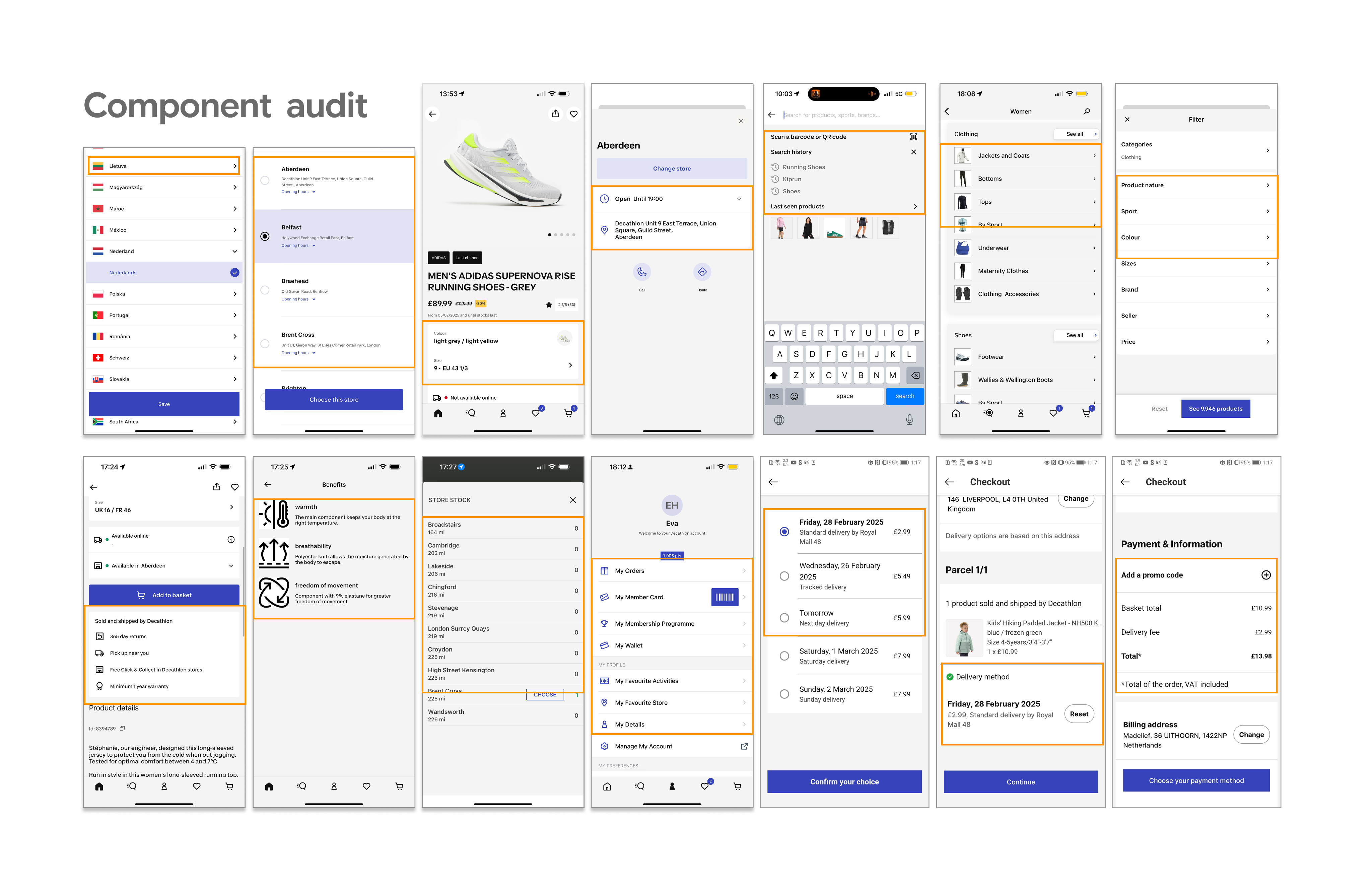
Audit of repeated app patterns that revealed opportunities to consolidate fragmented components into a more scalable system.
Lead with foundations before screens
I decided to start with typography, colors, and icons across the app before focusing on individual screen redesigns.
This created a consistent baseline, allowed platform-level efficiency, and reduced the risk of each team interpreting the Brand ID differently.
Treat Brand ID as product quality, not just visual styling
I reframed the work from, “Apply the new brand” to “Use the new brand as a chance to improve clarity, consistency, accessibility, and system scalability.”
This helped the work move beyond decoration and made it relevant to product, engineering, and business stakeholders.
Use planned roadmap work to avoid disruption
I chose to implement the Brand ID through planned roadmap initiatives rather than asking for dedicated redesign sprints.
This made the work realistic, easier to approve, and less disruptive to business-critical delivery.
Create master components instead of redesigning repeated patterns one by one
The audit showed that similar list and display patterns were repeated across screens using different components.
I designed List Flex as a flexible base component that could support multiple use cases while staying aligned with native app patterns and the new Brand ID.
This reduced design fragmentation, improved consistency, and gave engineering a more maintainable component model. Today, it is used across around 80% of app screens.
Make accessibility part of the component quality bar
Accessibility was treated as non-negotiable. For central design system components, accessibility foundations were already considered. For app-specific components, I designed with accessibility in mind and aligned with the broader accessibility audit initiative.
This helped ensure the revamp improved the app responsibly, not only visually.
Revamp version
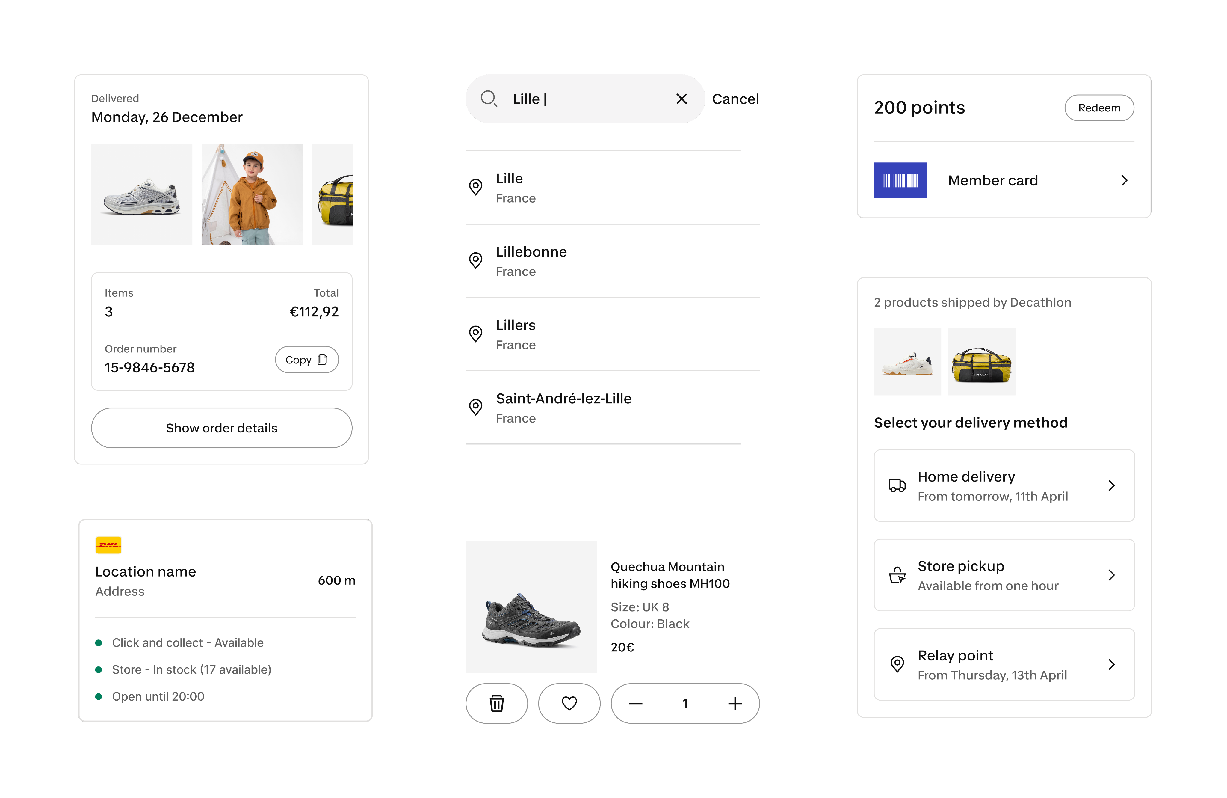
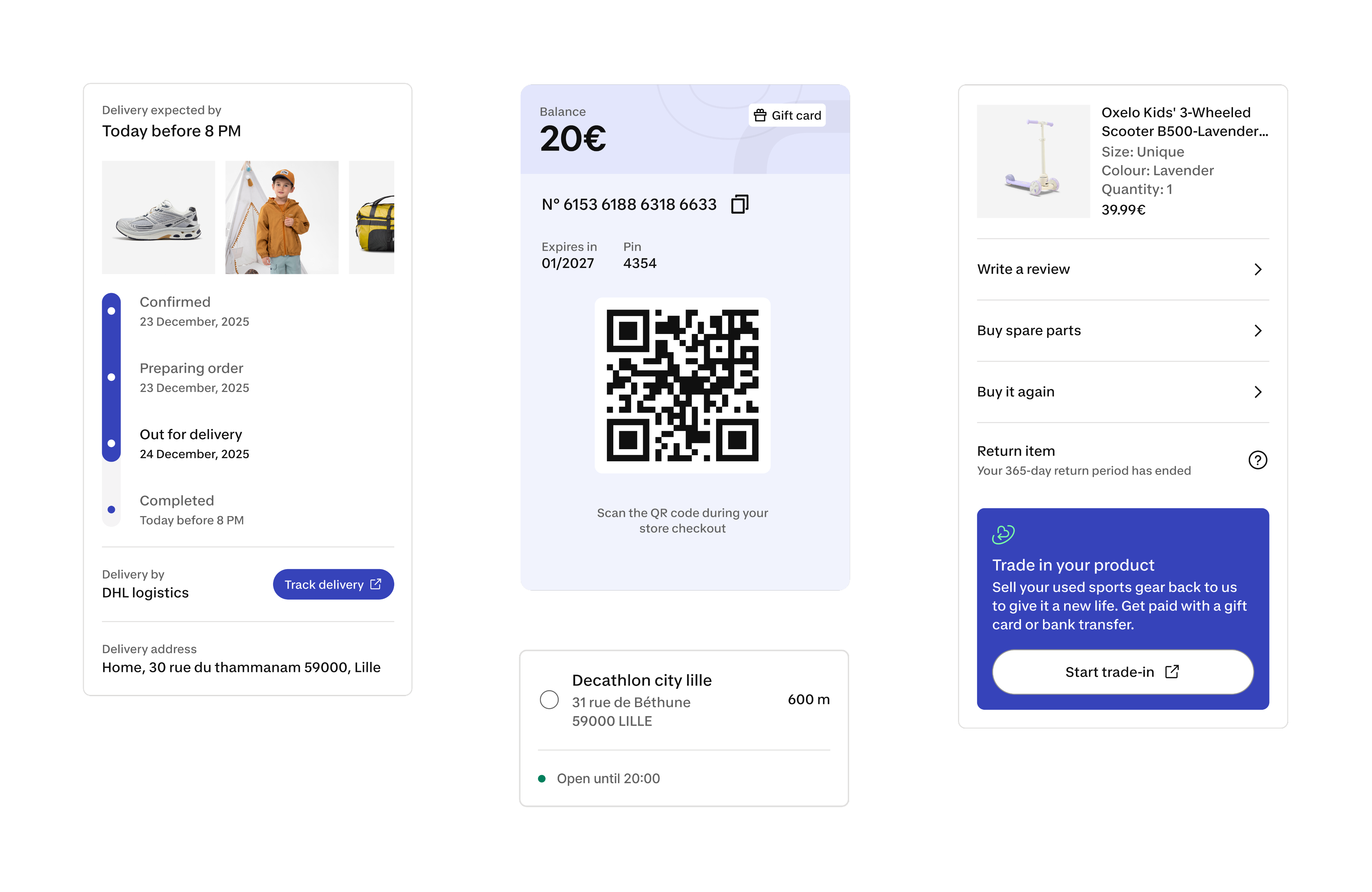
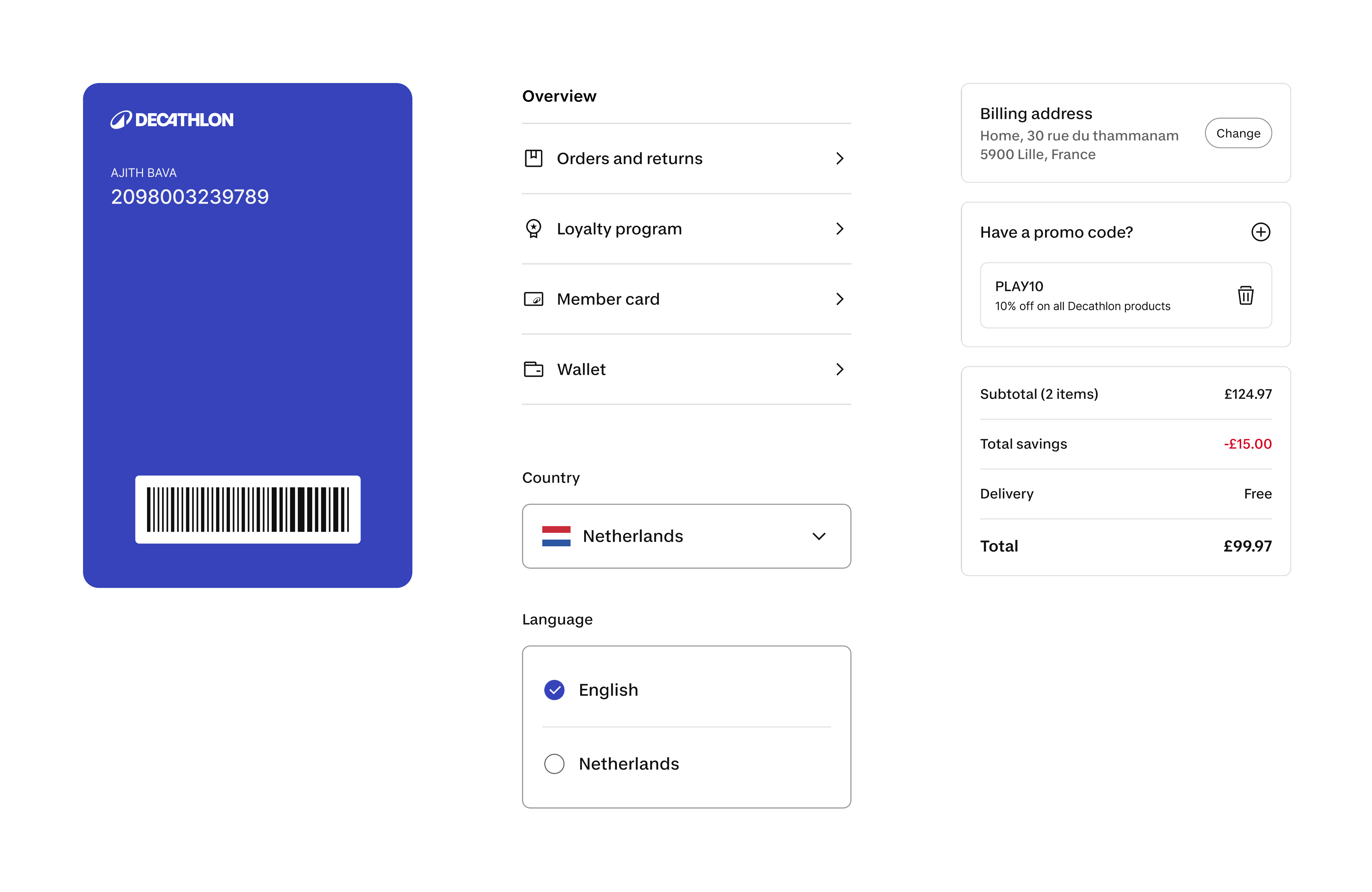
Updated templates combining design system foundations with app-specific components to improve consistency across the shopping experience.
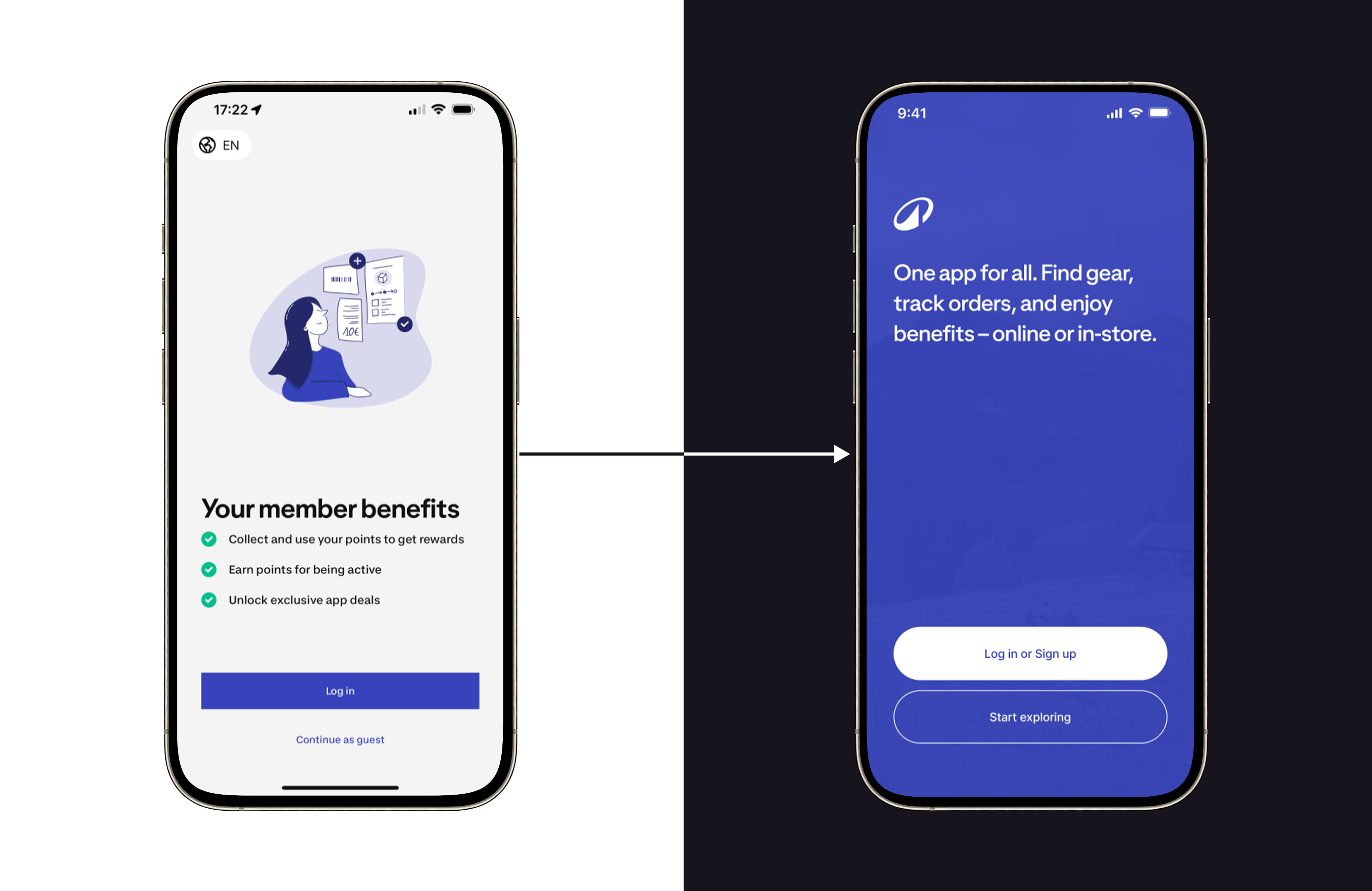
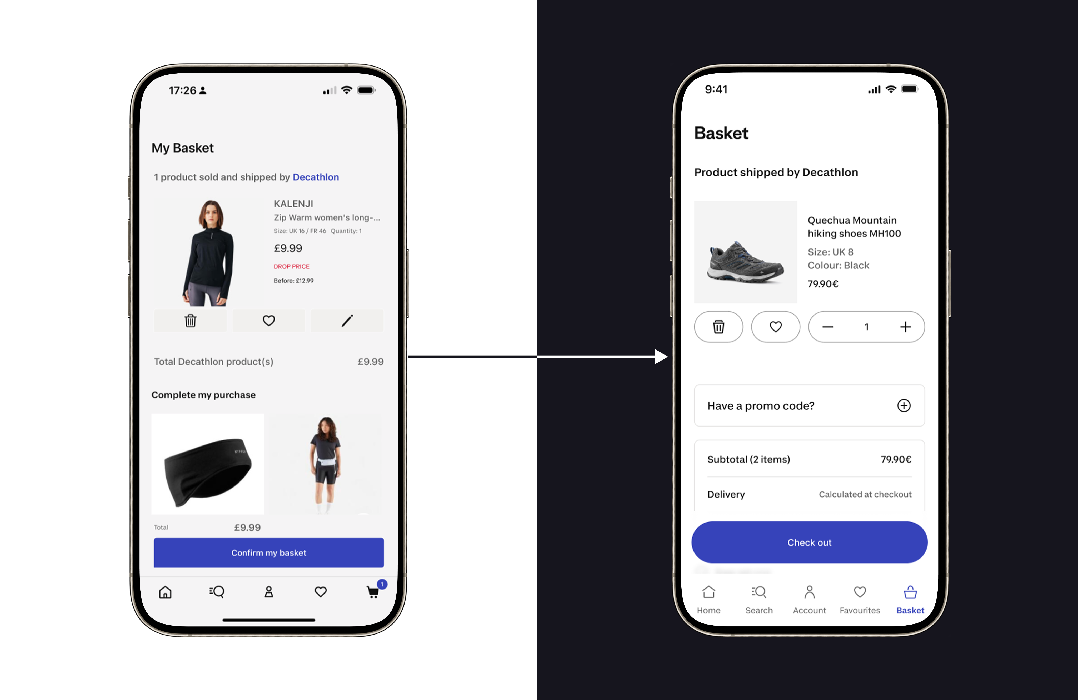
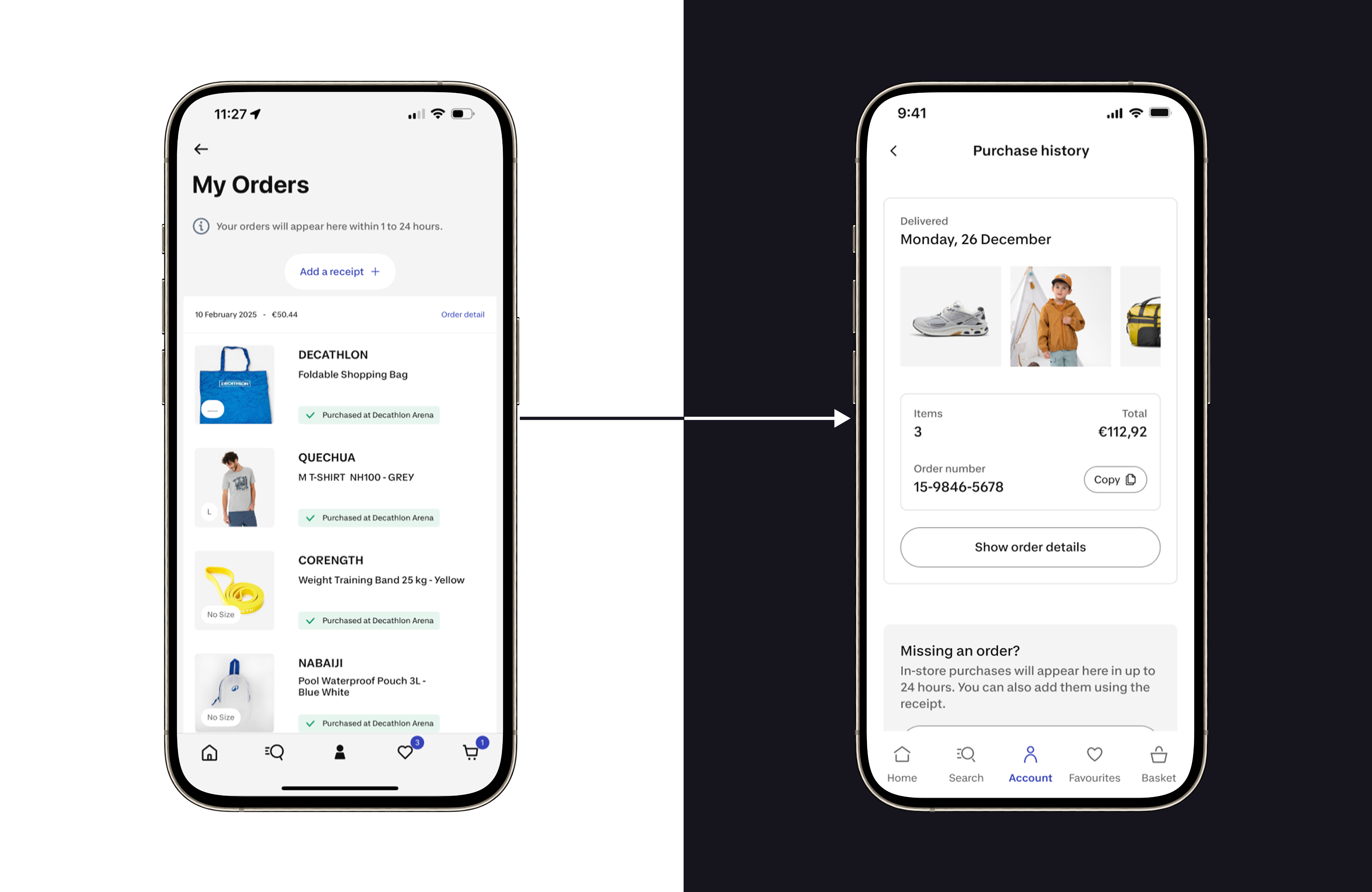
Core journey screens before and after the revamp, showing improvements in hierarchy, clarity, and Brand ID alignment.
Why?
Similar content-display patterns were implemented differently across app screens, creating inconsistency and duplicated maintenance.
My strategy
I audited app screens, mapped repeated use cases, adapted Material Design and Apple Human Interface Guidelines, and designed a flexible component that could support multiple native app contexts.
Result
List Flex became a base component for around 80% of app screens. It made updates easier because changes could be applied centrally and reflected across direct and child use cases.
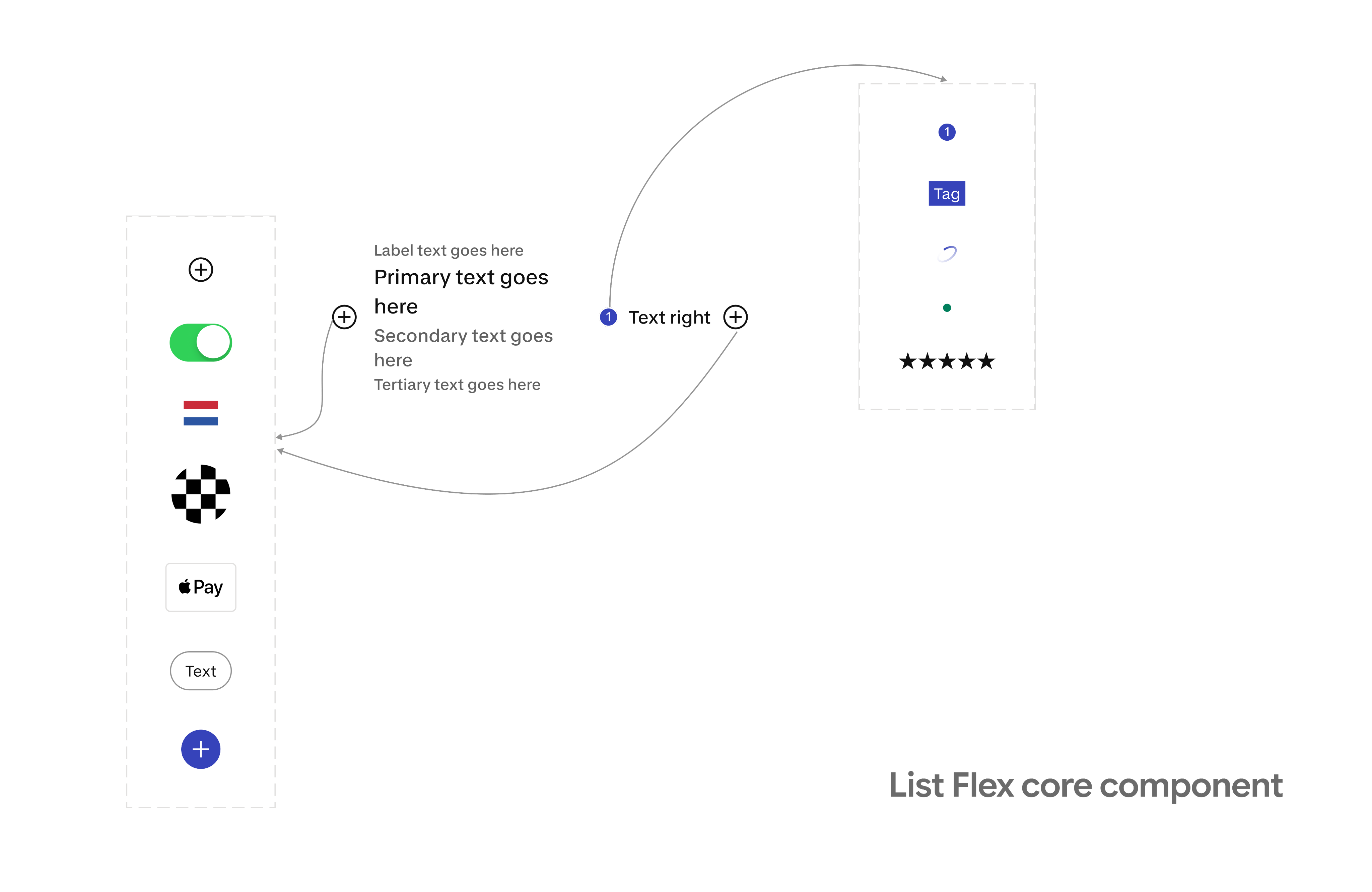
List Flex turned fragmented display patterns into one scalable component foundation, balancing flexibility in Figma with controlled variations that engineering could implement and maintain efficiently.
This prototype shows how List Flex adapts across different shopping app contexts, allowing teams to reuse one component structure instead of creating separate components for every use case.
Impact
Design system
List flex, A scalable app-specific component now used across around 80% of app screens.
Product impact
The Shopping App adopted the new Brand ID foundations without dedicated redesign sprints and without significantly disrupting roadmap priorities.
Engineering impact
The component consolidation reduced duplicated implementation effort on the engineering.
Strategic impact
The revamp created a foundation for applying Decathlon’s app experience principles in real product work, moving the effort beyond visual refresh toward a shared decision system for design, product, engineering, and data.
What’s next?
Experience direction beyond UI revamp
What it is?
The next step is to move beyond UI revamp and turn the new Brand ID into a practical App Experience Direction, a shared set of principles that helps design, product, engineering, and data teams make better product decisions, not just better-looking screens.
Context
The Brand ID rollout helped modernize the app foundations and core screens. Now the opportunity is to elevate the experience itself: making the app feel more Decathlon, more native, more useful, and more consistent across key journeys.
My role
I’m leading the translation of these experience principles into practical Shopping App guidance: defining how they apply to real flows, components, and product decisions, so future work improves not only visual consistency but also clarity, trust, accessibility, and native usability.
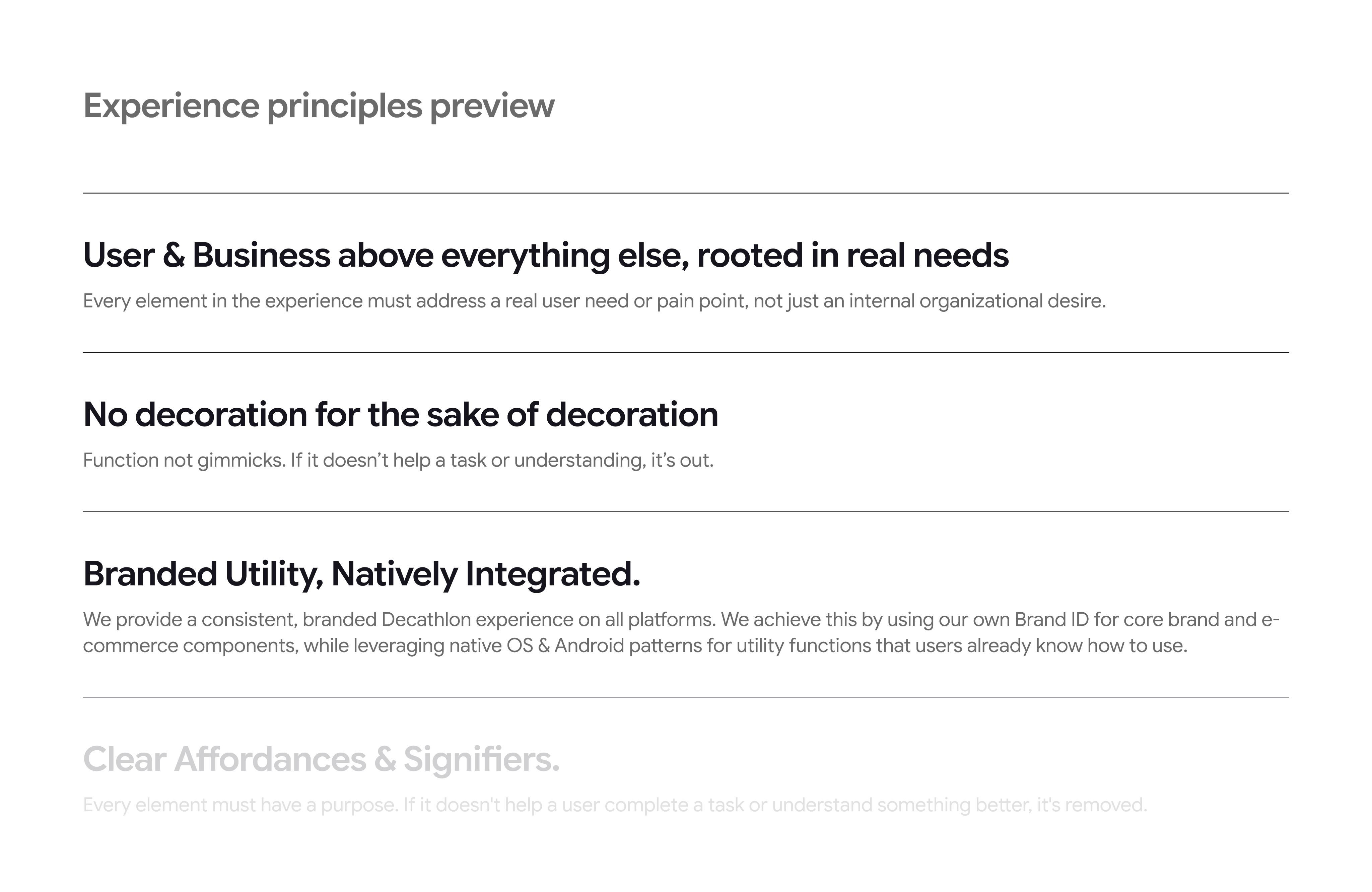
These principles extend the revamp beyond UI updates by creating a shared decision framework for clarity, utility, trust, and native product experience.
The takeaway
This work turned a Brand ID update into a practical product transformation. It improved the quality and consistency of core app journeys, created reusable foundations like List Flex, and helped teams move faster without treating the revamp as a separate redesign project.
App revamp
Revamping the shopping app with a scalable design system.

Design Systems
Craft Leadership
At a glance
Scope
Brand ID strategy, foundation updates, app-specific component system, core screen revamp, design guidelines, and experience principles translation.

Impact & contribution
Implemented the new Brand ID across core app foundations without dedicated redesign sprints, created List Flex, a scalable component now used across around 80% of app screens, and reduced duplicated design/development patterns.
And I turned a brand refresh into a scalable app experience system, balancing brand expression, product roadmap delivery, native platform quality, accessibility, and long-term maintainability.
Decathlon introduced a new Brand ID connected to its broader North Star: moving people through the wonders of sport. The Shopping App needed to adopt this new identity, but the challenge was not simply applying new colors, typography, icons, and components.
The real challenge was strategic. How could we implement the new Brand ID progressively, without dedicated redesign sprints, while minimizing impact on the product roadmap and using the opportunity to improve product craft, consistency, and design system scalability?
I led the Brand ID implementation strategy for the Shopping App, presented it to Product, Design, and App leadership, and secured approval. I then worked with platform, engineering, design system, and product partners to update app foundations, adopt available design system components, and create app-specific scalable components.
The app needed to evolve without stopping roadmap delivery
There were no dedicated sprints for a full revamp. Product teams still needed to deliver business and user opportunities, so the rollout had to work within existing roadmap priorities.
The new design system did not cover all app needs
The central native design system covered only part of the Shopping App’s needs. Many app-specific patterns were still owned and maintained internally by the Shopping App team.
App-specific components were fragmented
During my audit, I found that similar display patterns were being solved with different components across different screens. For example, the app had multiple components serving similar list or content-display purposes.
This created three risks
- Inconsistent experience for users
- More maintenance effort for designers
- More duplicated implementation effort for engineers
The biggest risk was treating Brand ID as decoration: new colors, new typography, new icons, same experience problems.
I wanted to use the revamp as an opportunity to improve the product system behind the interface: foundations, components, screen quality, accessibility, and experience principles.
This connects strongly to the App Design & Experience Direction, which defines the purpose as creating a customer/member-first experience that gets people quickly to the right next step while communicating Decathlon’s value around convenience, trust, guidance, value, personalization, and omnichannel.
A progressive Brand ID update that improved the Account screen’s hierarchy, clarity, and sense of personal ownership.
Create a progressive rollout strategy and secure leadership approval
My first contribution was making the Brand ID rollout feel achievable and valuable for leadership.
I presented a strategy to Product, Design, and App leadership that avoided a risky “big bang” redesign. Instead, I proposed a progressive model.
Fix the basics firstUpdate typography, colors, and icons across the app with support from the App platform team.
Adopt available design system componentsImplement central design system components where they already existed, such as CTAs and form inputs.
Revamp app-specific componentsAudit and redesign Shopping App-specific components that were not covered by the central system.
Use roadmap work as the rollout vehicleApply Brand ID improvements through already planned product initiatives, so the revamp would not require dedicated redesign sprints.
This helped get approval because the strategy balanced brand ambition with roadmap reality.
Use roadmap priorities to drive implementation
Instead of creating a separate Brand ID backlog, I mapped the app screens involved in already planned roadmap work.
For example, when roadmap initiatives touched areas like Purchase History, Cart, Checkout, Account, or PDP, we used those moments to apply the new Brand ID and improve screen quality.
This allowed the team to modernize the app without slowing down user and business priorities.
The trade-off was that the app could temporarily feel visually inconsistent while only some screens were revamped. To manage that, I later helped prioritize critical journey screens so the experience would feel more coherent across the core shopping flow.
Turned component fragmentation into a design system opportunity
The central design system covered only part of the app, so I led an audit of app-specific components.
I mapped
- Which components appeared across screens
- Where similar use cases were being solved differently
- Which patterns could be consolidated
- Which components needed to respect native iOS and Android expectations
- Which elements needed to be flexible enough for multiple app contexts
This led to the creation of List Flex, a scalable app-specific component that now acts as a base component for around 80% of app screens.
Translated experience principles into practical app guidance
Together with the Design Director, the team defined 10 experience design principles for the app. The direction frames these principles as an Experience North Star, a shared language across design, product, engineering, and data, and a product decision system that can translate principles into acceptance criteria.
My role is now to translate those principles into practical Shopping App applications.
For example, the principle “Branded Utility, Natively Integrated” helps guide when we should use Decathlon Brand ID for core brand and commerce moments, and when we should rely on familiar native OS patterns for utility functions.
Audit of repeated app patterns that revealed opportunities to consolidate fragmented components into a more scalable system.
Lead with foundations before screens
I decided to start with typography, colors, and icons across the app before focusing on individual screen redesigns.
This created a consistent baseline, allowed platform-level efficiency, and reduced the risk of each team interpreting the Brand ID differently.
Treat Brand ID as product quality, not just visual styling
I reframed the work from, “Apply the new brand” to “Use the new brand as a chance to improve clarity, consistency, accessibility, and system scalability.”
This helped the work move beyond decoration and made it relevant to product, engineering, and business stakeholders.
Use planned roadmap work to avoid disruption
I chose to implement the Brand ID through planned roadmap initiatives rather than asking for dedicated redesign sprints.
This made the work realistic, easier to approve, and less disruptive to business-critical delivery.
Create master components instead of redesigning repeated patterns one by one
The audit showed that similar list and display patterns were repeated across screens using different components.
I designed List Flex as a flexible base component that could support multiple use cases while staying aligned with native app patterns and the new Brand ID.
This reduced design fragmentation, improved consistency, and gave engineering a more maintainable component model. Today, it is used across around 80% of app screens.
Make accessibility part of the component quality bar
Accessibility was treated as non-negotiable. For central design system components, accessibility foundations were already considered. For app-specific components, I designed with accessibility in mind and aligned with the broader accessibility audit initiative.
This helped ensure the revamp improved the app responsibly, not only visually.
Revamp version
Updated templates combining design system foundations with app-specific components to improve consistency across the shopping experience.
Core journey screens before and after the revamp, showing improvements in hierarchy, clarity, and Brand ID alignment.
Why?
Similar content-display patterns were implemented differently across app screens, creating inconsistency and duplicated maintenance.
My strategy
I audited app screens, mapped repeated use cases, adapted Material Design and Apple Human Interface Guidelines, and designed a flexible component that could support multiple native app contexts.
Result
List Flex became a base component for around 80% of app screens. It made updates easier because changes could be applied centrally and reflected across direct and child use cases.
List Flex turned fragmented display patterns into one scalable component foundation, balancing flexibility in Figma with controlled variations that engineering could implement and maintain efficiently.
This prototype shows how List Flex adapts across different shopping app contexts, allowing teams to reuse one component structure instead of creating separate components for every use case.
Impact
Design system
List flex, A scalable app-specific component now used across around 80% of app screens.
Product impact
The Shopping App adopted the new Brand ID foundations without dedicated redesign sprints and without significantly disrupting roadmap priorities.
Engineering impact
The component consolidation reduced duplicated implementation effort on the engineering.
Strategic impact
The revamp created a foundation for applying Decathlon’s app experience principles in real product work, moving the effort beyond visual refresh toward a shared decision system for design, product, engineering, and data.
What’s next?
What it is?
The next step is to move beyond UI revamp and turn the new Brand ID into a practical App Experience Direction, a shared set of principles that helps design, product, engineering, and data teams make better product decisions, not just better-looking screens.
Context
The Brand ID rollout helped modernize the app foundations and core screens. Now the opportunity is to elevate the experience itself: making the app feel more Decathlon, more native, more useful, and more consistent across key journeys.
My role
I’m leading the translation of these experience principles into practical Shopping App guidance: defining how they apply to real flows, components, and product decisions, so future work improves not only visual consistency but also clarity, trust, accessibility, and native usability.
These principles extend the revamp beyond UI updates by creating a shared decision framework for clarity, utility, trust, and native product experience.
The takeaway
This work turned a Brand ID update into a practical product transformation. It improved the quality and consistency of core app journeys, created reusable foundations like List Flex, and helped teams move faster without treating the revamp as a separate redesign project.
App revamp
Revamping the shopping app with a scalable design system.

Design Systems
Craft Leadership
At a glance
Scope
Brand ID strategy, foundation updates, app-specific component system, core screen revamp, design guidelines, and experience principles translation.

Impact & contribution
Implemented the new Brand ID across core app foundations without dedicated redesign sprints, created List Flex, a scalable component now used across around 80% of app screens, and reduced duplicated design/development patterns.
And I turned a brand refresh into a scalable app experience system, balancing brand expression, product roadmap delivery, native platform quality, accessibility, and long-term maintainability.
Summary
Decathlon introduced a new Brand ID connected to its broader North Star: moving people through the wonders of sport. The Shopping App needed to adopt this new identity, but the challenge was not simply applying new colors, typography, icons, and components.
The real challenge was strategic. How could we implement the new Brand ID progressively, without dedicated redesign sprints, while minimizing impact on the product roadmap and using the opportunity to improve product craft, consistency, and design system scalability?
I led the Brand ID implementation strategy for the Shopping App, presented it to Product, Design, and App leadership, and secured approval. I then worked with platform, engineering, design system, and product partners to update app foundations, adopt available design system components, and create app-specific scalable components.
Problem
The app needed to evolve without stopping roadmap delivery
There were no dedicated sprints for a full revamp. Product teams still needed to deliver business and user opportunities, so the rollout had to work within existing roadmap priorities.
The new design system did not cover all app needs
The central native design system covered only part of the Shopping App’s needs. Many app-specific patterns were still owned and maintained internally by the Shopping App team.
App-specific components were fragmented
During my audit, I found that similar display patterns were being solved with different components across different screens. For example, the app had multiple components serving similar list or content-display purposes.
This created three risks
- Inconsistent experience for users
- More maintenance effort for designers
- More duplicated implementation effort for engineers
The biggest risk was treating Brand ID as decoration: new colors, new typography, new icons, same experience problems.
I wanted to use the revamp as an opportunity to improve the product system behind the interface: foundations, components, screen quality, accessibility, and experience principles.
This connects strongly to the App Design & Experience Direction, which defines the purpose as creating a customer/member-first experience that gets people quickly to the right next step while communicating Decathlon’s value around convenience, trust, guidance, value, personalization, and omnichannel.
A progressive Brand ID update that improved the Account screen’s hierarchy, clarity, and sense of personal ownership.
My Approach
Create a progressive rollout strategy and secure leadership approval
My first contribution was making the Brand ID rollout feel achievable and valuable for leadership.
I presented a strategy to Product, Design, and App leadership that avoided a risky “big bang” redesign. Instead, I proposed a progressive model.
Fix the basics firstUpdate typography, colors, and icons across the app with support from the App platform team.
Adopt available design system componentsImplement central design system components where they already existed, such as CTAs and form inputs.
Revamp app-specific componentsAudit and redesign Shopping App-specific components that were not covered by the central system.
Use roadmap work as the rollout vehicleApply Brand ID improvements through already planned product initiatives, so the revamp would not require dedicated redesign sprints.
This helped get approval because the strategy balanced brand ambition with roadmap reality.
Use roadmap priorities to drive implementation
Instead of creating a separate Brand ID backlog, I mapped the app screens involved in already planned roadmap work.
For example, when roadmap initiatives touched areas like Purchase History, Cart, Checkout, Account, or PDP, we used those moments to apply the new Brand ID and improve screen quality.
This allowed the team to modernize the app without slowing down user and business priorities.
The trade-off was that the app could temporarily feel visually inconsistent while only some screens were revamped. To manage that, I later helped prioritize critical journey screens so the experience would feel more coherent across the core shopping flow.
Turned component fragmentation into a design system opportunity
The central design system covered only part of the app, so I led an audit of app-specific components.
I mapped
- Which components appeared across screens
- Where similar use cases were being solved differently
- Which patterns could be consolidated
- Which components needed to respect native iOS and Android expectations
- Which elements needed to be flexible enough for multiple app contexts
This led to the creation of List Flex, a scalable app-specific component that now acts as a base component for around 80% of app screens.
Translated experience principles into practical app guidance
Together with the Design Director, the team defined 10 experience design principles for the app. The direction frames these principles as an Experience North Star, a shared language across design, product, engineering, and data, and a product decision system that can translate principles into acceptance criteria.
My role is now to translate those principles into practical Shopping App applications.
For example, the principle “Branded Utility, Natively Integrated” helps guide when we should use Decathlon Brand ID for core brand and commerce moments, and when we should rely on familiar native OS patterns for utility functions.
Audit of repeated app patterns that revealed opportunities to consolidate fragmented components into a more scalable system.
Key decisions I made
Lead with foundations before screens
I decided to start with typography, colors, and icons across the app before focusing on individual screen redesigns.
This created a consistent baseline, allowed platform-level efficiency, and reduced the risk of each team interpreting the Brand ID differently.
Treat Brand ID as product quality, not just visual styling
I reframed the work from, “Apply the new brand” to “Use the new brand as a chance to improve clarity, consistency, accessibility, and system scalability.”
This helped the work move beyond decoration and made it relevant to product, engineering, and business stakeholders.
Use planned roadmap work to avoid disruption
I chose to implement the Brand ID through planned roadmap initiatives rather than asking for dedicated redesign sprints.
This made the work realistic, easier to approve, and less disruptive to business-critical delivery.
Create master components instead of redesigning repeated patterns one by one
The audit showed that similar list and display patterns were repeated across screens using different components.
I designed List Flex as a flexible base component that could support multiple use cases while staying aligned with native app patterns and the new Brand ID.
This reduced design fragmentation, improved consistency, and gave engineering a more maintainable component model. Today, it is used across around 80% of app screens.
Make accessibility part of the component quality bar
Accessibility was treated as non-negotiable. For central design system components, accessibility foundations were already considered. For app-specific components, I designed with accessibility in mind and aligned with the broader accessibility audit initiative.
This helped ensure the revamp improved the app responsibly, not only visually.
Revamp version
Updated templates combining design system foundations with app-specific components to improve consistency across the shopping experience.
Core journey screens before and after the revamp, showing improvements in hierarchy, clarity, and Brand ID alignment.
List Flex component system
Why?
Similar content-display patterns were implemented differently across app screens, creating inconsistency and duplicated maintenance.
My strategy
I audited app screens, mapped repeated use cases, adapted Material Design and Apple Human Interface Guidelines, and designed a flexible component that could support multiple native app contexts.
Result
List Flex became a base component for around 80% of app screens. It made updates easier because changes could be applied centrally and reflected across direct and child use cases.
List Flex turned fragmented display patterns into one scalable component foundation, balancing flexibility in Figma with controlled variations that engineering could implement and maintain efficiently.
This prototype shows how List Flex adapts across different shopping app contexts, allowing teams to reuse one component structure instead of creating separate components for every use case.
Impact
Design system
List flex, A scalable app-specific component now used across around 80% of app screens.
Product impact
The Shopping App adopted the new Brand ID foundations without dedicated redesign sprints and without significantly disrupting roadmap priorities.
Engineering impact
The component consolidation reduced duplicated implementation effort on the engineering.
Strategic impact
The revamp created a foundation for applying Decathlon’s app experience principles in real product work, moving the effort beyond visual refresh toward a shared decision system for design, product, engineering, and data.
What’s next?
Experience direction beyond UI revamp
What it is?
The next step is to move beyond UI revamp and turn the new Brand ID into a practical App Experience Direction, a shared set of principles that helps design, product, engineering, and data teams make better product decisions, not just better-looking screens.
Context
The Brand ID rollout helped modernize the app foundations and core screens. Now the opportunity is to elevate the experience itself: making the app feel more Decathlon, more native, more useful, and more consistent across key journeys.
My role
I’m leading the translation of these experience principles into practical Shopping App guidance: defining how they apply to real flows, components, and product decisions, so future work improves not only visual consistency but also clarity, trust, accessibility, and native usability.
These principles extend the revamp beyond UI updates by creating a shared decision framework for clarity, utility, trust, and native product experience.
The takeaway
This work turned a Brand ID update into a practical product transformation. It improved the quality and consistency of core app journeys, created reusable foundations like List Flex, and helped teams move faster without treating the revamp as a separate redesign project.
